
Ethical Merchants
Revamping a sustainable shopping website for better brand trust and discoverability
Introduction
Overview
Ethical Merchants is a sustainable shopping platform that hosts a wide range of ethical and eco-friendly brands. Established in 2020, the platform aims to make shopping for sustainable and ethical goods easy for the masses by streamlining the discovery and shopping process.
Role & Scope
The project was done in a team of 4.
My role: User research, wireframing, prototyping and UI
Timeline: 8 weeks
Platforms: Desktop and Mobile Web
Team: Joseph Mok, Iris Koh and Loh Li Wei
Challenge & Objectives
The main challenge here is that Ethical Merchants is fairly new and does not have a very strong customer base yet. The business has been seeing low conversion rates and there is little knowledge about the users.
Through discussions with the primary stakeholder, we decided on 3 main objectives:
Learn about Ethical Merchant’s target users and how they navigate the website
Discover user pain points while navigating the website
Find out users' views on Ethical Merchants' blog and discover ways to improve the feature
The Process

5 Stages of Design thinking
Empathise
User surveys and interviews were conducted to learn more about how users navigate through the website, and discover pain points. As the platform did not have a very large user base yet, the research was conducted with proxy users of varying levels of knowledge on sustainable shopping. The results obtained were analysed afterwards.
Define
After the analysis of the results, problem statements were defined. This provides a better direction for the ideation of solutions in the next stage.
Ideate
As a team, we proceeded to brainstorm for solutions by drawing inspiration from other shopping platforms and generated a word-cloud (with accordance to the most common keywords obtained from the user research). These ideas were then translated into mid-fi wireframes and reviewed with the stakeholder. After further iterations, mockups were created.
Prototype & Test
A few of the users that underwent the user interviews were invited for usability testing, where they were asked to complete a few tasks and rate the ease of completing the tasks. The scores were then evaluated, to determine if further iteration needed to be done before the final handover to the web developer.
User Research
User survey
Our team conducted a survey with a total of 49 respondents in the span of a few days. The goals of the survey are to:
Find out the motivations behind sustainable shopping
Discover the purchasing habits of users that shop for ethical or sustainable goods
Summary of Key Findings
Most respondents that purchase sustainable goods tend to buy smaller items like personal care products and coffee or tea
Even though most respondents are aware or have knowledge of sustainable consumption, only a small percentage will bring this into consideration when they are shopping
Majority of respondents will check up on a brand before purchasing
The quality and price of products are main considerations for respondents that are looking into purchasing sustainable/ethical products
Respondents have the impression that sustainable products usually come with a higher price tag

Most respondents had at least some knowledge of sustainable consumption

Of the respondents that purchased a sustainable product recently (last 6 months), most of the purchases were personal care products, followed by coffee/tea and then, clothing

The majority of respondents do not put much consideration into a product's sustainability and ethics before their purchase, despite their knowledge on such issues.

Most respondents will spend some time to look up more information on a brand before purchasing an item

Quality and price are major considerations when it comes to purchasing ethical and sustainable goods
User Interviews

From the respondents that participated in the survey, we invited 9 of them to take part in user interviews. The objectives of the user interviews are:
To investigate the users' motivation behind sustainable/ethical shopping
To find out the users' perceptions of the website and blog
To understand the customer journey, touchpoints and pain points on the website
To validate findings from the user survey
Usability Testing
As part of the interview, we also conducted usability testing, where we gave the users a few tasks to complete on the mobile and desktop site. The tasks include browsing the website, purchasing a cup and learning more information about Ethical Merchants.
Metrics measured included the task completion success and user satisfaction levels (out of 5).
Key Findings
Users generally spent more time than intended to look for the information of individual brands on the website. Most will tend to go to Google instead to find the information as they found it hard to do so on the platform itself.
Users found it difficult to locate the 'About' page on the website.
Majority of the users found it straightforward and easy to purchase an item (from finding a cup to adding to cart and to checkout).
Majority of users gave a rating of 3/5 for satisfaction

Consolidation of all user research findings using affinity mapping
So, what pain points do users have? 🤔
#1 Information about Ethical Merchants is not readily accessible
The 'About' page is located at the footer of the website and can easily be missed out on. As a result, users find it difficult to access information about Ethical Merchants, especially if they are new to the platform. This can in turn, affect the users' trust in Ethical Merchants as a brand.

#2 Information about each brand is not readily accessible
Currently, clicking on each brand via the menu only brings users to the product catalog. To find out more about each brand, users will have to click on a product listing and scroll down to the bottom of the product listing page. Alternatively, there is a page which shows information on all the brands hosted on Ethical Merchants. However, this page is "hidden", where the only way to access it is to click on 'Brands' on the navigation bar.
Such information is important, given that 69.4% of users we surveyed are likely to read up more on a brand before purchasing an item. We observed similar behaviour during our user interviews as well.

Brand information is at the bottom of the product listing page
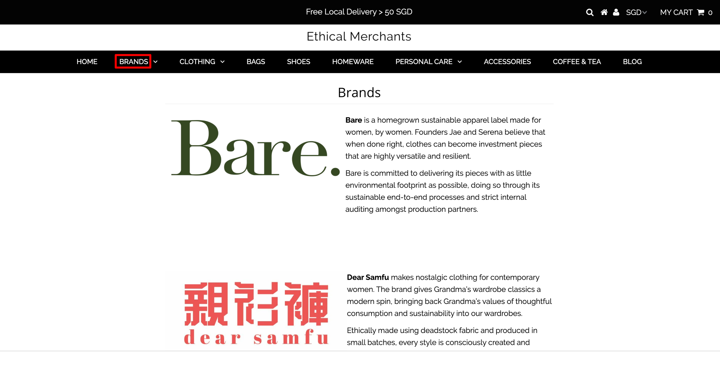
The 'Brands' page can only be accessed by clicking on 'Brands', which makes the page pretty much hidden
#3 The position of the blog makes it easy to be neglected by users
One of the entry points to the blog is the navigation bar. As the navigation bar is already cluttered with many options (most of which are categories of products sold on the website), the 'Blog' option can easily get missed out by users.
Another entry point is the footer, where the 'Blog' option might get missed out on as well.

'Blog' can be easily missed out due to the clutter on the navigation bar

'Blog' is located at the footer, which can get missed out
#4 The navigation bar is cluttered
From the user interviews, most users have mentioned that there is too much information on the navigation bar. The navigation bar is populated with all of the categories of products available on Ethical Merchants and can get overwhelming for users that are just looking to explore and learn more, before purchasing an item.

Creating a Persona & Customer Journey
One of the objectives of the project was to learn about Ethical Merchant’s target users and how they navigate the website. In order to achieve this, a user persona and customer journey map was created.


Defining the Problem Statements
From the above pain points and research findings, we defined two problem statements.
1. How might we increase the brand trust of Ethical Merchants?
2. How might we increase the accessibility of each brand’s information?
Both problem statements put an emphasis on increasing the visibility of information of Ethical Merchants, as well as the individual brands that are hosted on the website. These help users understand the nuance behind the brands and may possibly increase their motivation to purchase.
Ideation
Solution
Based on the pain points and research findings, our team centered the solution around a few areas:
Simplify and reduce clutter on the navigation bar for easier access to information (e.g. 'About') and shopping catalogue
Explore and increase entry points to individual brand information and 'About' page
Re-position the entry point to 'Blog' to increase the page's discoverability
We started brainstorming for ideas by generating a word cloud that is centered around increasing brand discoverability and trust.

We then proceeded to creating low fidelity wireframes to aid in our planning of the visual hierarchy of various elements.

Prototype & Test
Usability Test
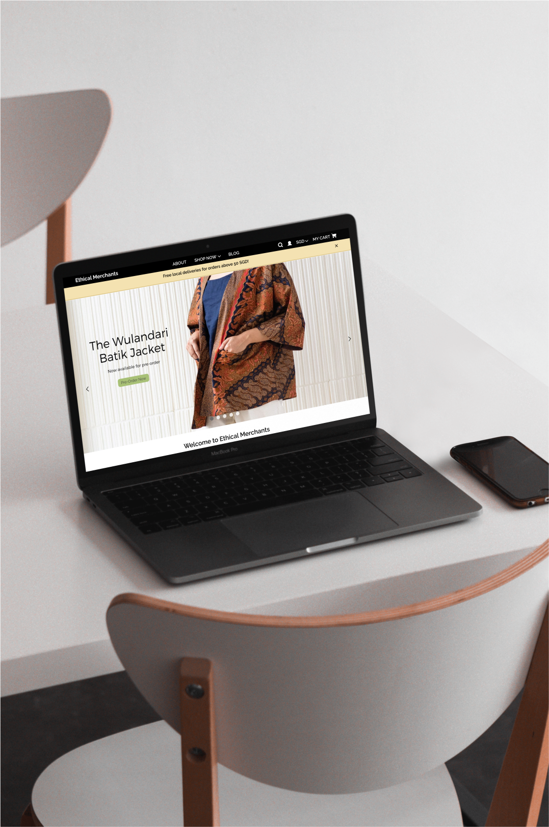
Using the wireframes, we made prototypes for the mobile and desktop web, and invited 5 users to test the prototypes out. The users were asked to complete the tasks similar to those of the first round of testing — browsing the website (including looking for brands of interest) and learning more information about Ethical Merchants. The goal of the test is to assess if the designs solves user pain points and to determine if further iterations are required.
The mobile prototype can be accessed here and desktop prototype can be accessed here.
The metrics measured includes the time taken to complete the task and user satisfaction levels (out of 5).
Results
Users generally managed to access information of individual brands without much difficulty and took lesser time than previously
The 'About' page was much easier to locate and to learn more about Ethical Merchants
Users mentioned that the navigation bar is looked less overwhelming and found it easier to look for brands or products they are interested in
Majority of users gave a rating of 4/5 when asked to rate the experience, an improvement from previous test
Some users felt that the featured blog posts can be better displayed on the Homepage
Final Design
Following feedback from the usability test, our team did further iterations on the design. We then created a style guide and mockups for the final design to be handed off to the developer. The prototypes can be accessed here: mobile and desktop.
Style Guide
Since Ethical Merchants is a sustainable platform, our team decided to use earthy tones and green. We chose to keep the font the same (Raleway), for readability.

Mockups

Conclusion
Project Review
Looking back at the users' pain points and research findings, we can see that a large percentage is centered around the lack of brand discoverability and brand trust. To tackle this in the UX perspective, our team came up with some solutions:
Placing the entry point to Ethical Merchants' 'About' page on the navigation bar. This allows users to be able to find out more about Ethical Merchants easily and through understanding the platform's efforts, we hope to increase the users' trust towards the platform.
Increasing the entry points for individual brand information. Since most users have mentioned that they tend to look up about a brand before purchase, we placed such information at various touch points — 'About' page, each brand's product catalogue page, individual product listing page.
Making the navigation bar simpler, with less options at the first level. With this, the 'Blog' option becomes more visible. In addition, users can access the blog from each brand's product catalogue page and individual product listing page as well.
Learnings
User recruitment for research was definitely a challenge for this project, particularly because Ethical Merchants is a relatively new platform and does not have a large customer base yet. To overcome this challenge, our team leveraged on social media and personal networks and conducted research with users of varying interests in sustainability. Ideally, another round of user research should be done when Ethical Merchants gets a larger base of customers, to find out if there are any pain points that existing users experience.
Next Steps
Our team has successfully handed over the final design to the developer. Once the design gets implemented on the website, the next step will be to monitor various metrics to determine if the design is effective in elevating the conversion rate. Further user research will also need to be conducted with existing users to see if more iteration is required.